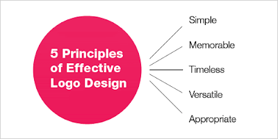
What makes a good logo? A good logo is distinctive, appropriate, practical, graphic, simple in form and conveys an intended message.
There are five principles that you should follow to ensure that this is so…
An effective logo is (in no particular order):
- Simple
- Memorable
- Timeless
- Versatile
- Appropriate
1. Simple
A simple logo design allows for easy recognition and allows the logo to be versatile & memorable. Good logos feature something unique without being overdrawn.
2. Memorable
Following closely behind the principle of simplicity, is that of memorability. An effective logo design should be memorable and this is achieved by having a simple, yet, appropriate logo.
3. Timeless
An effective logo should be timeless – that is, it will stand the test of time. Will the logo still be effective in 10, 20, 50 years?
Probably the best example of a timeless logo is the Coca-Cola logo… if you compare it to the Pepsi logo below, you can see just how effective creating a timeless logo can be. Notice how the Coca Cola logo has barely changed since 1885? That is timeless design.
4. Versatile
An effective logo should be able to work across a variety of mediums and applications. For this reason a logo should be designed in vector format, to ensure that it can be scaled to any size. The logo should be able to work both in horizontal and vertical formats.
Ask yourself; is a logo still effective if:
- Printed in one colour?
- Printed on the something the size of a postage stamp?
- Printed on something as large as a billboard?
- Printed in reverse (ie. light logo on dark background)
5. Appropriate
It is also important to state that that a logo doesn’t need to show what a business sells or offers as a service. ie. Car logos don’t need to show cars, computer logos don’t need to show computers. The Harley Davidson logo isn’t a motorcycle, nor is the Nokia logo a mobile phone. A logo is purely for identification.


Pas certain que le logo Coca Cola soit si "Timeless". C'est juste qu'après 120 ans de matraquage de réclame, notre petit cerveau l’accepte comme normal. Il fait partie de notre histoire. Non ?
RépondreSupprimerVery interesting tutorial. I like to share this post with my friends and book mark this interesting page. Keep it up and I will be back soon
RépondreSupprimer